Objective
To create a suitable typeface for your chosen design.
To evidence your understanding of the expressiveness of typography.
Task
Over two double pages of your sketchbook, experiment with hand drawn typefaces that could be used within your design. This could be a title or another graphic element.
You can work in colour or black and white. Leave in your mistakes.
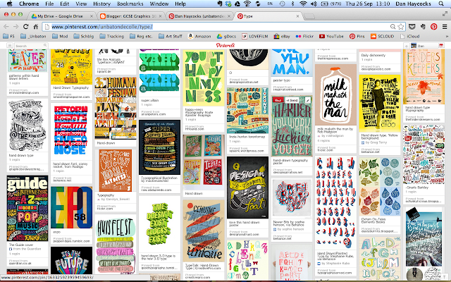
Look on my Type Pinboard for inspiration... (HERE)
Presentation
Photograph or screenshot your progress.
Post to your blog.
Checklist for assessment
4 pages of experiments, beautifully bustling and busy pages of creativity.
Time needed
2 hrs.
Deadline
Only to be attempted when all other tasks are up to date.
Objective
To gather further primary research for your unit 1 project.
To enable those who feel drawing is weak to collect useful primary research.
Within the mark scheme, AO3 states: 'Record ideas, observations and insights relevant to their intentions in visual and/or other forms.'
Task
1. Consider the subject matter for your project. Take a collection of 30+ images that you could either edit and use in the final artefact or just use as drawing/illustration reference.
To get the best results form this task, be as creative as you can with your subject and composition.
As an example, if you have a wise old wizard in your book—and don't have a wise old wizard to hand—dress up your friend/dad/self in a bed sheet, cardboard hat and long stick. Pose them in different, relevant positions.
Or, look on YouTube for tutorials about how to create wise old wizard make-up. There are loads of tutorials (plenty on zombies) on make-up. Make sure you then photograph the 'making of' period.
You will get plenty of good results from using your initiative.
Do not make excuses as to why you couldn't get interesting images, there is no excuse.
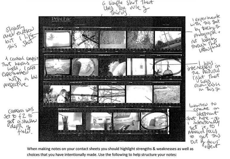
2. Screen shot the collection of thumbnail photographs. (see presentation above)
Open in Photoshop (or print off and write on the paper) and annotate -
- Circle image that are good. This might be due to them being in focus, correct composition etc.
- Cross out images that are not to be used. Out of focus, badly cropped, wrong position etc.
- Write simple notes against the photos, 'out of focus', 'too far away' or 'too dark',
- Make your annotations obvious - write in pink?
Within the contact sheet presentation, comment on the following:
- What were your intentions for the shoot? Why take these images?
- What are the successful elements, What worked well?
- What were the unsuccessful elements? What didn't work well?
- If you were to take these images again, what would you do to make them more suitable?
- Do you believe that you have all the shots you need for the project? If not, what others do you need to take?
Presentation
Either in sketchbook or GSlides
Checklist for assessment
Lots of interesting photographs with concise and insightful evaluative annotations.
Deadline
First lesson back after the Summer hols.